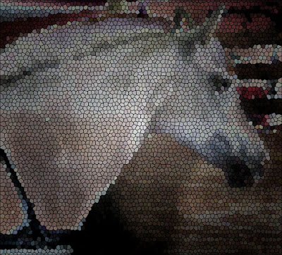
This is Billy at a driving show. Below the photograph was changed and has "glowing edges."


Abbe...I have already removed part of her harness. Below I used the mosaic style.


This one is more subtle. The flower below is outlined. Please click on these last two photographs so that you can really see the alterations more clearly...particularly the lily.


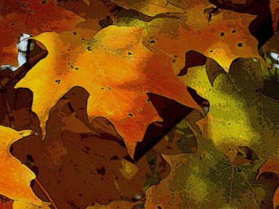
The leaves were altered by using "poster edges."

To see more examples: http://sundaystills.wordpress.com
I could do about 20 more of these!!!!

13 comments:
Looks like you are having fun with photoshop. Maybe one day!!!!I'll learn to use it.
Nice work. I've never tried Photoshop but it looks like fun.
Hi Lori, I really like the poster edges on the leaves! Thanks for putting up the originals for comparison..it was a fun challenge, different but fun:)
Great pictures Lori. I really like the lily, like you say subtle, but very effective.
very cool! Good job!
Nicely done!
Thanks for this. I usually have to use photoshop for much more mundane and prosaic tasks that I often fail to see the artistic possibilities. With your example, I will certainly have a try now!
Very cool! I love that lilly when it's photoshopped...VERY cool look to it! Nice job!
Very nicely done. :):) I really liked the leaves.
Beautifully done! Your creativity shines through. And I love the Before photos, too. :)
~Lisa
I just love how Abbe's photo came out - the lines are simple and dynamic without a riot of color, just the right amount for stunning highlights. Also love the poster edge effect, perfect for the autumn leaves.
By the way, who is that gorgeous fella prancing away beside Abbe on your blog header ?
My first thought was the same as Diane; looks like you had fun with this! The leaves and lily are beautiful, but I like the first one the best. It seems to have more motion than the original.
The leaves are great, and clicking on the lily you can really see the difference, yet it does look subtle when smaller. So, go ahead, have more fun and share!!
Post a Comment